Design drop · review
Cards v5 — 3 redraws
Each redraw shown at homepage-card scale (3:2). Below each, Design’s reasoning. Greenlight the ones you like and I’ll swap the live homepage thumbs.
1. Pink Mist — NEW thumb (no live equivalent)
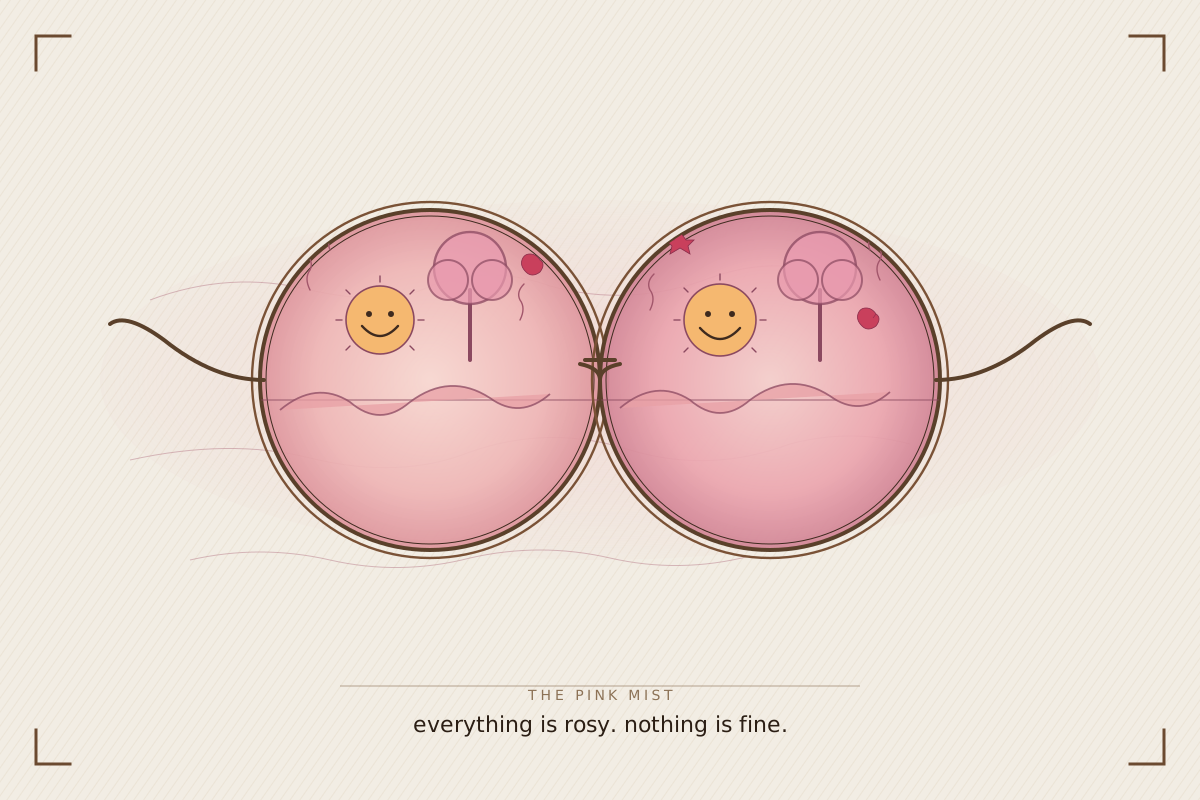
At actual homepage card size (~300×200)
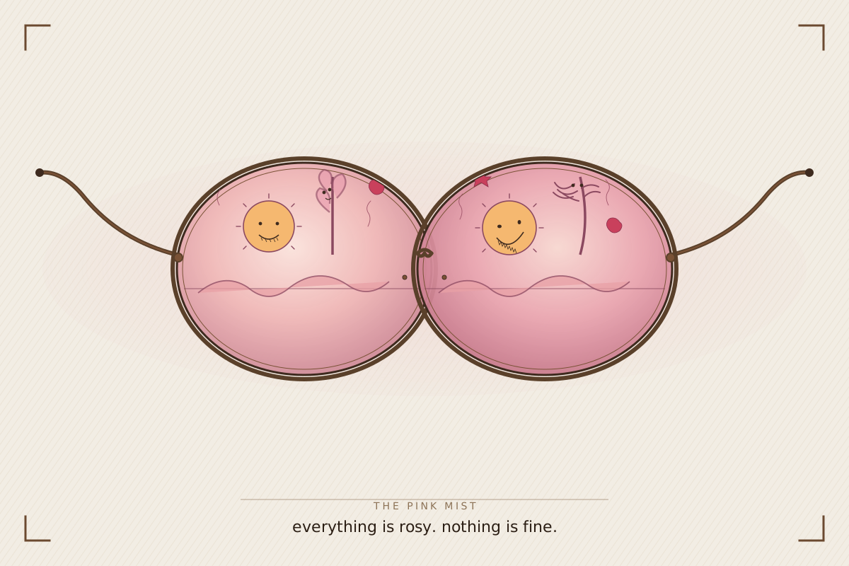
Design’s read: Two vintage rose-tinted glasses laid flat. Through each lens, the same scene — rendered wrong on inspection. Left lens looks superficially fine; right lens is obviously off. The viewer sees the distortion before the wearer does — which is the point of the Pink Mist as a recovery stage. Doubles as the chapter graphic for the book.
2. Map of Quit v2 — corrects chronology
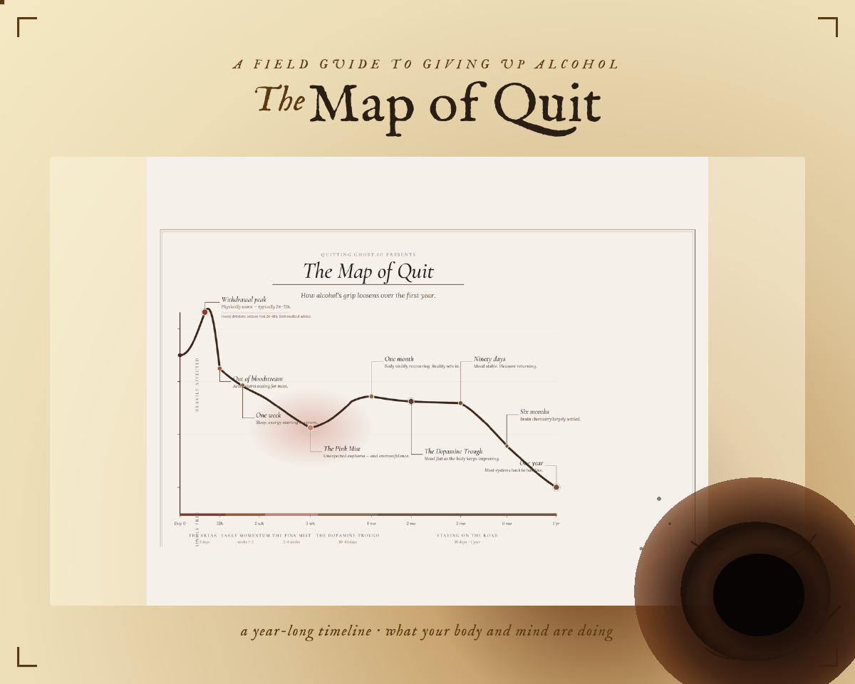
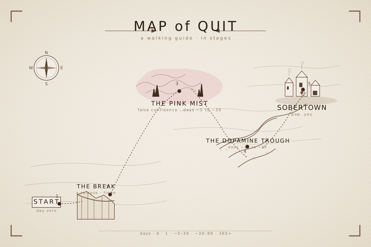
At actual homepage card size (~300×200)
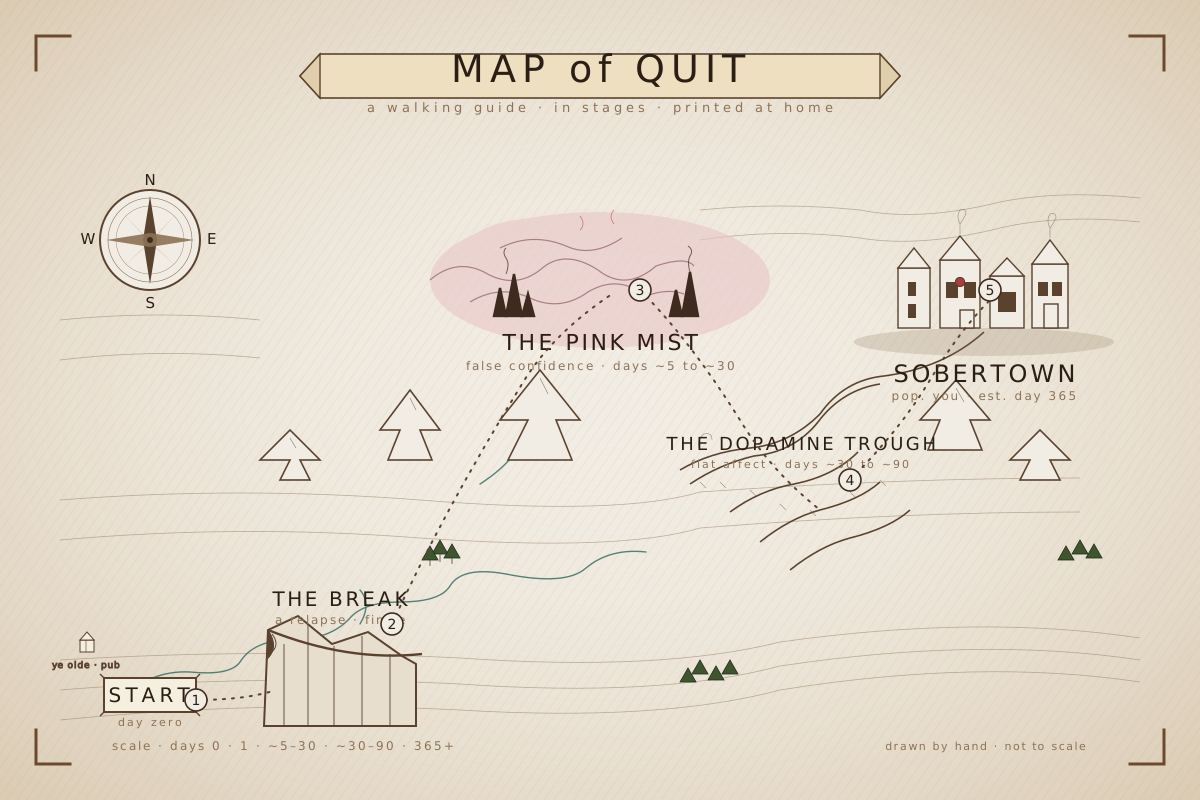
Design’s read: The previous map had the chronology wrong. Actual journey: START → BREAK (early relapse at the cliff) → PINK MIST (false-confidence rosy phase, in the cloud bank) → DOPAMINE TROUGH (the hard part, valley) → SOBERTOWN (destination). Each stop numbered in order. Day-scale at the bottom: day 0 · day 1 · 5–30 · 30–90 · 365+. Compass moved upper-left so it doesn’t conflict with the path.
3. Why Not Quit v2 — magnifier → brass balance scale

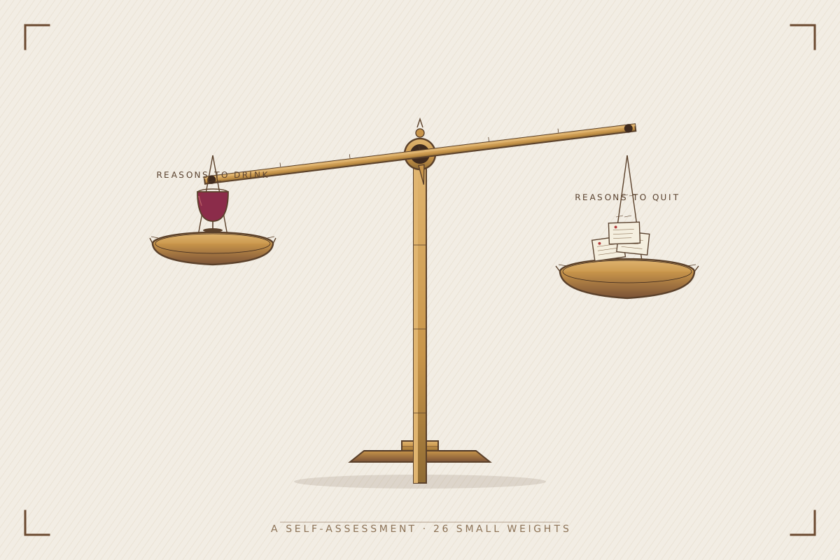
At actual homepage card size (~300×200)
Design’s read: Magnifier was a non-sequitur for an intro to a self-assessment quiz. What a quiz actually is: put each reason on a pan and see which side the beam tips toward. So — brass apothecary scale. Left pan: a single wine glass (case for drinking, easy to point at). Right pan: stack of folded notes (case for quitting, many small reasons, no single one decisive). Beam tipped slightly toward the notes. Caption: A SELF-ASSESSMENT · 26 SMALL WEIGHTS.
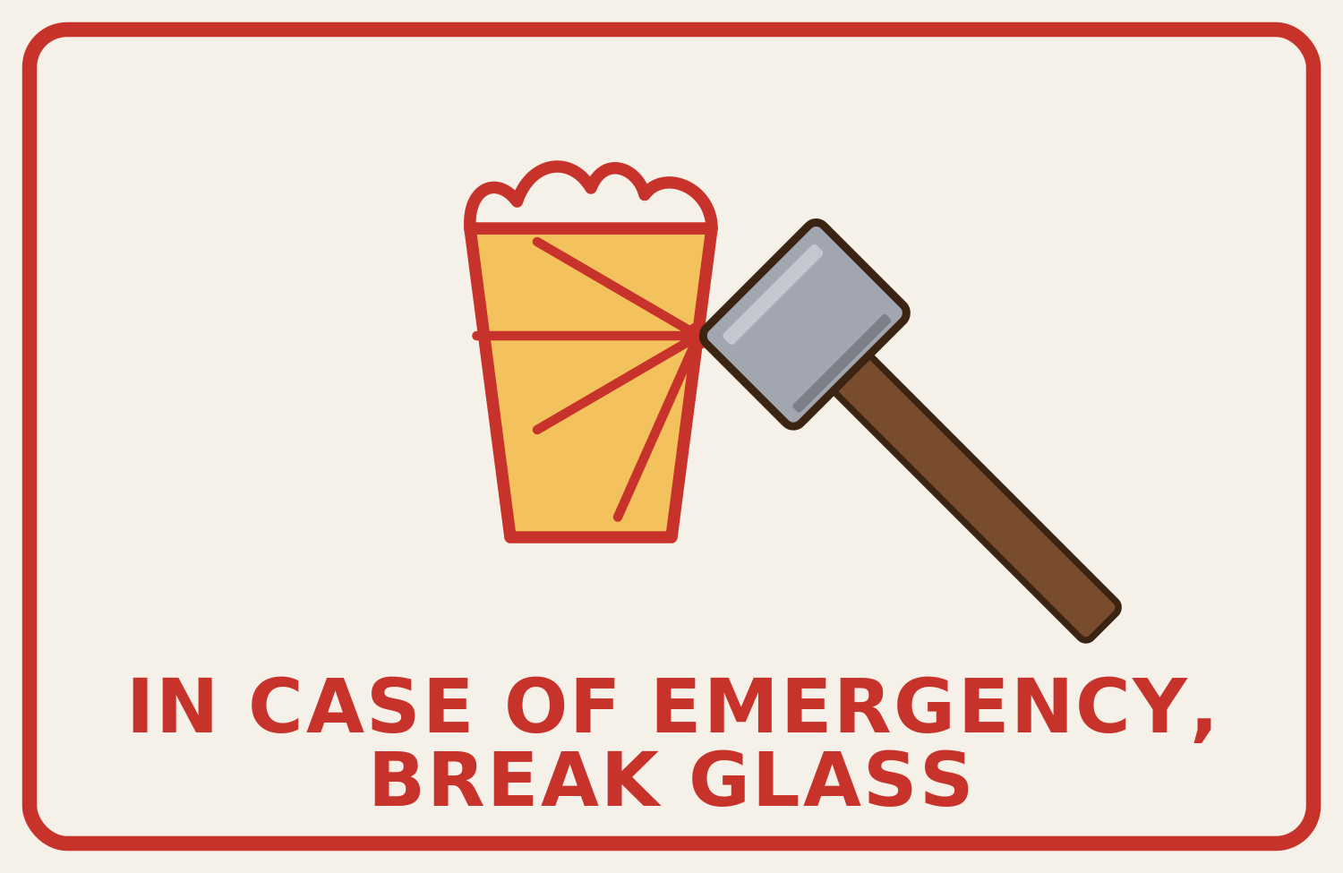
4. Emergency Escalator — 3-way: live vs Design v4 vs combo
You wanted the live beer-pint glass + sledgehammer but Design’s serif typography. Built a combo on the right. Field-guide cream + corner brackets backdrop (from Design), your art (beer pint with foam + crack lines + sledgehammer), Design’s Lora bold serif with the burgundy red + tracked-out letter-spacing.
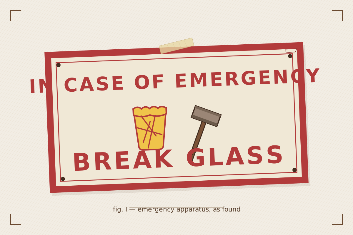
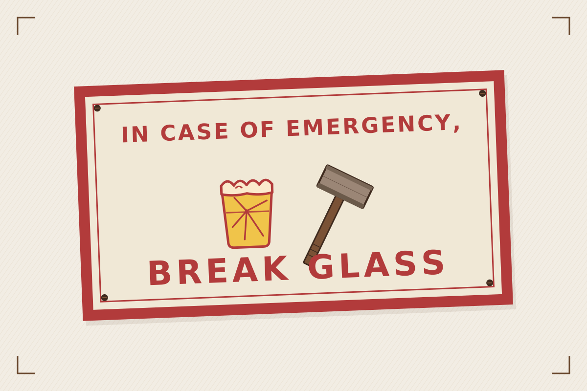
Combo at actual homepage card size (~300×200)
Combo details: kept your foam-topped pint with the crack lines radiating from a center impact, kept the sledgehammer with grip lines + dark head-stripes, dropped onto Design’s cream-paper backdrop with corner brackets, switched to Lora 700 serif at 58/84px with letter-spacing 6/10, burgundy #B23B3B. Slight -2.2° tilt + thumbtacks at the corners are Design’s — reads as a sign pinned to a field-guide page.
5. v5 Alternates — Design’s other takes (the wacky and the wishful)
Each shipped redraw above had an alternate Design also explored. Some are denser, some are weirder. Pick per-card: keep my shipped version, swap to the alternate, or commission another pass.
5a. Map of Quit — “detailed” alternate
5b. Pink Mist — v2 alternate
5c. Why Not Quit — v3 alternate
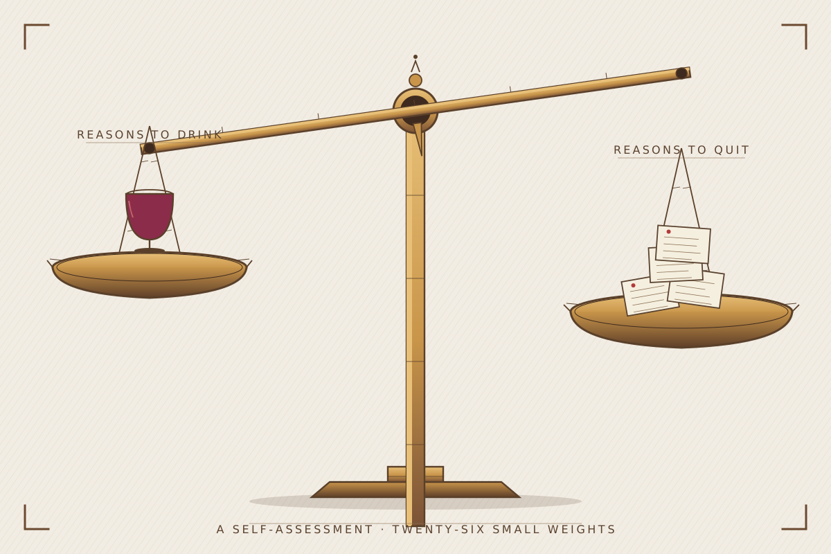
Note: Design didn’t write reasoning for these alts — they were exploration parked when the v2 versions read better. Worth a look regardless; you may see something I missed.
5d. Map of Quit — v4 Tolkien (the wacky one)
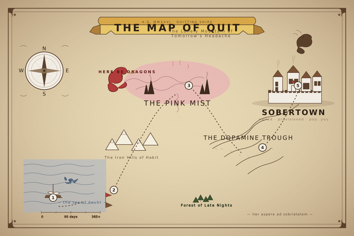
Full LOTR-style Middle-Earth pull-out: parchment hatch, cornered frame, calligraphy banner reading "THE MAP OF QUIT · A.D. MMXXVI · QUITTING SHIRE", compass rose with cardinal pip. Probably too far for a homepage thumb, possibly perfect as a chapter opener or printable spread in the book.
5e. Map of Quit — Tolkien-lite (edited down)
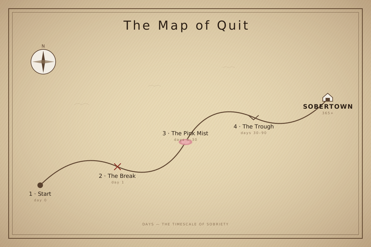
Took the parchment treatment + numbered stops, dropped “Quitting Shire” / “A.D. MMXXVI” / the full Middle-Earth cosplay. Keeps the warm tan paper feel + the journey beat, loses the cosplay. Probably the right register if you ever want a more “cartographer’s sketch” vibe vs the cleaner v2.
6. Other v4 redraws — Design also did these earlier; flag any worth shipping
Three thumbnails Design redrew in the v4 pass that aren’t shipped. Same field-guide register as Pink Mist + Why Not Quit v2. Yes/no per card — or flag for another round.
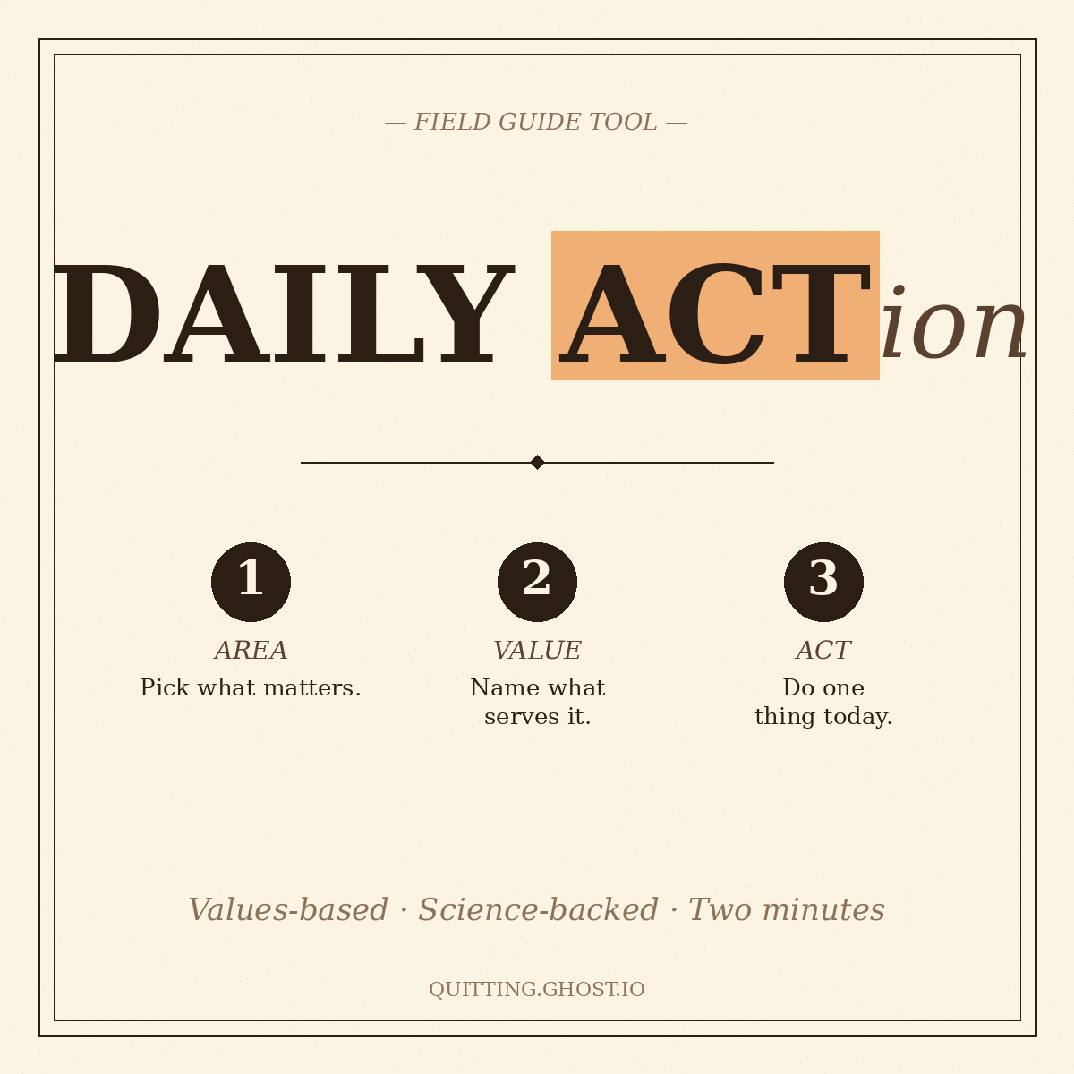
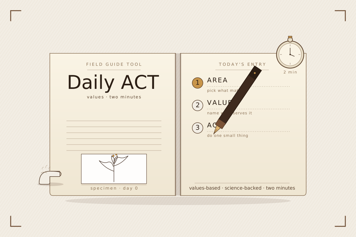
6a. Daily Action
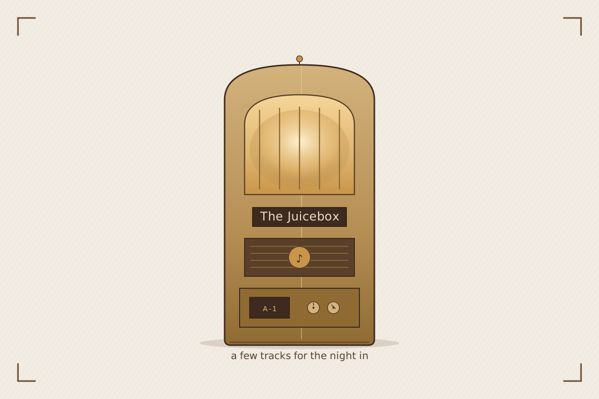
6b. The Juicebox (you said it “might need injected into graphic” — does this read like the existing one fits inside it?)

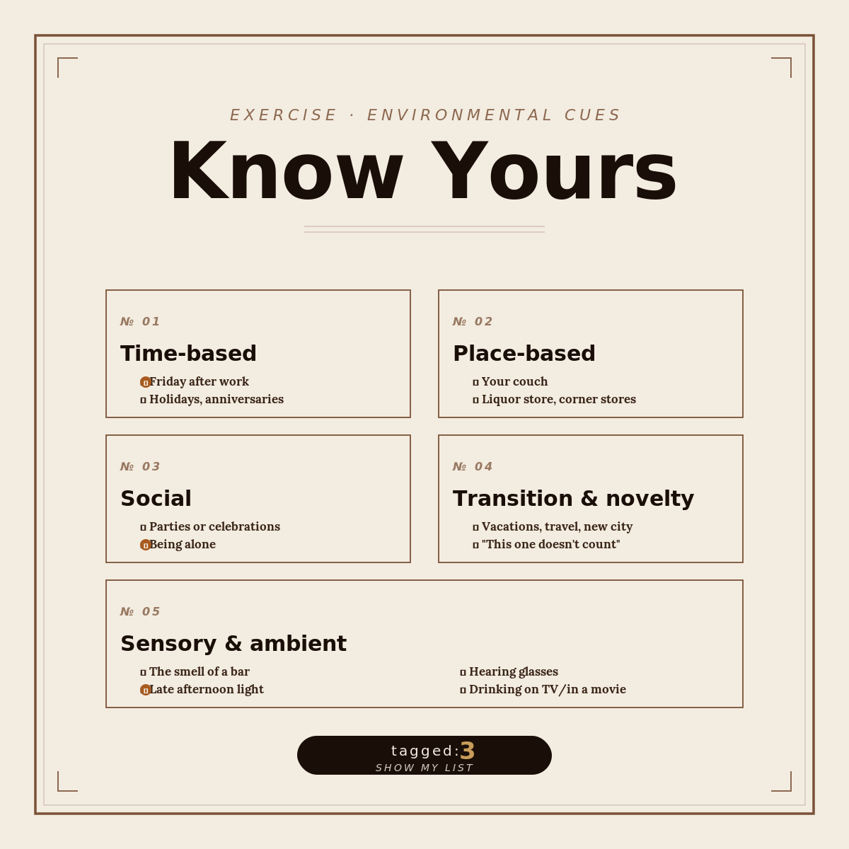
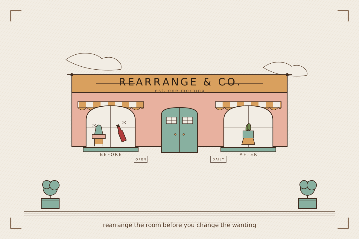
6c. Rearrange Your World (cue-audit)
Greenlight any/all, or flag changes. Then they swap onto the live homepage. ← back to /working/