Quitting · Design review
Homepage cards — in the wild
Design's homepage-cards-v2 treatments applied to the actual site card chrome, so you can see what the homepage would really look like under each option. Toggle below.
Same cards, same site chrome — only the thumbnail image filter changes. Hover swaps don't apply here; this is a static preview.
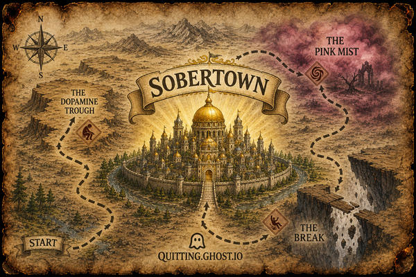
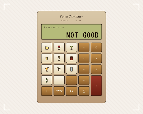


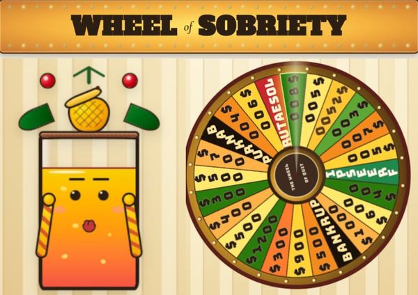


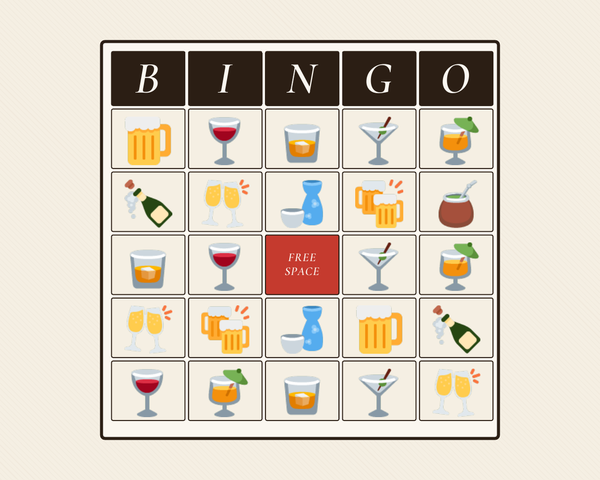

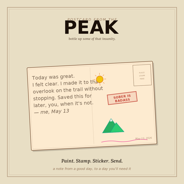
Mixed picks: Map of Quit uses A · Drink Calculator + Smarterer Soberer + Bingo use C · everything else uses B.
Editorial note
In Design's standalone preview, each treatment included its own chrome (paper mat, italic caption, corner dots) — that’s what would create the “frame within a frame” effect. Here I’ve stripped that and applied only the image-level changes (saturation, blend mode, border) inside the real site card. If you pick a treatment, this is what would actually land on the homepage.